WELCOME
L*Space Swimwear Slice of Paradise Campaign created with Adobe Premiere Pro. Footage shot by Ted Emmons.
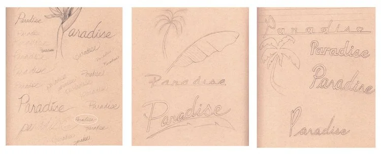
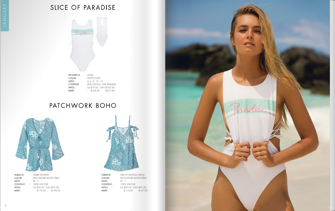
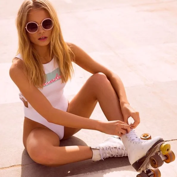
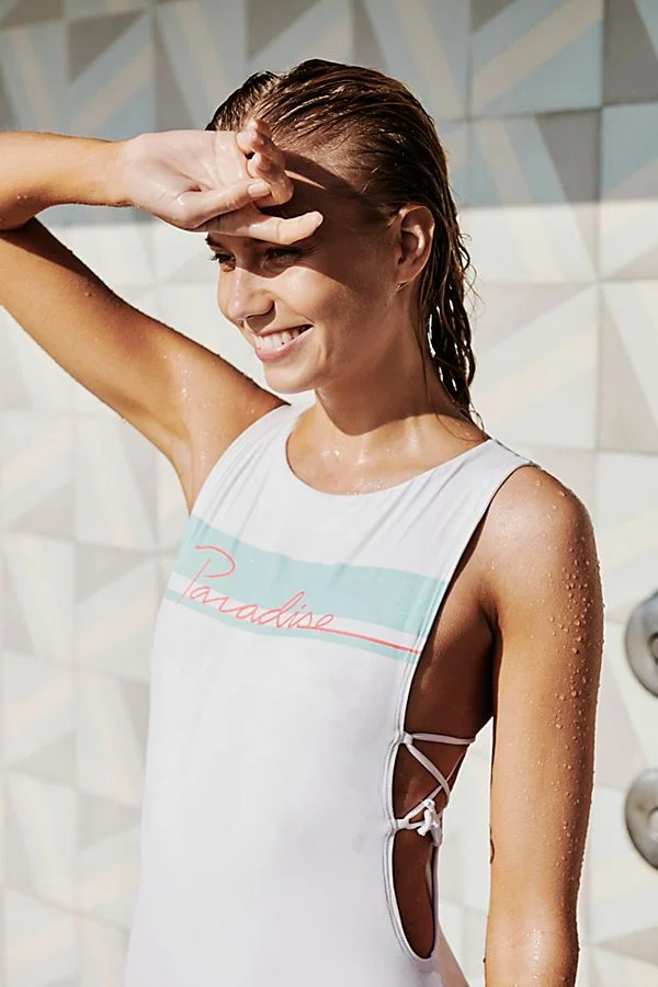
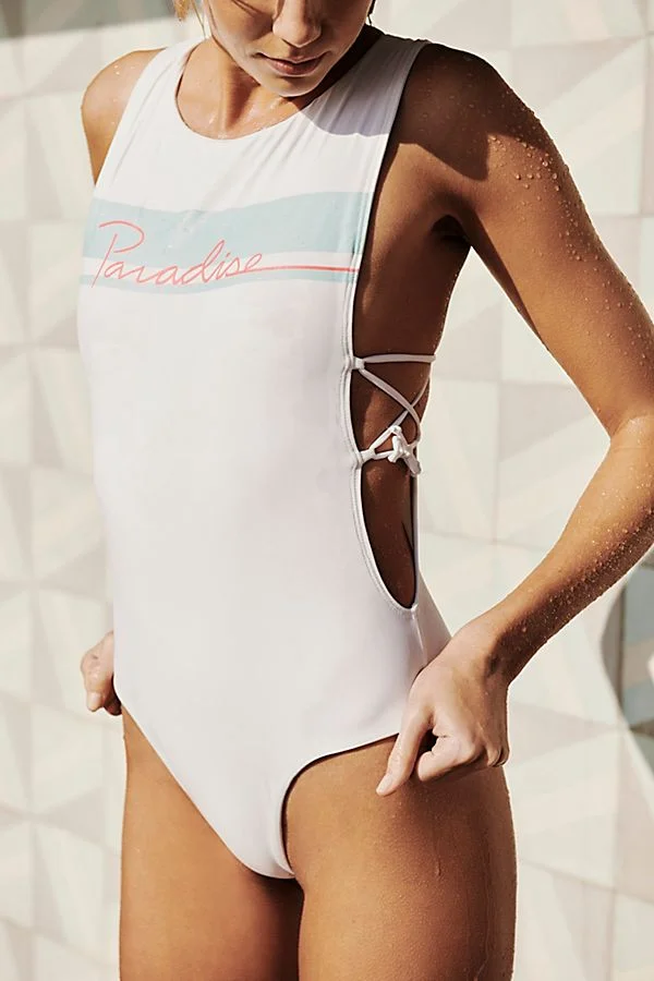
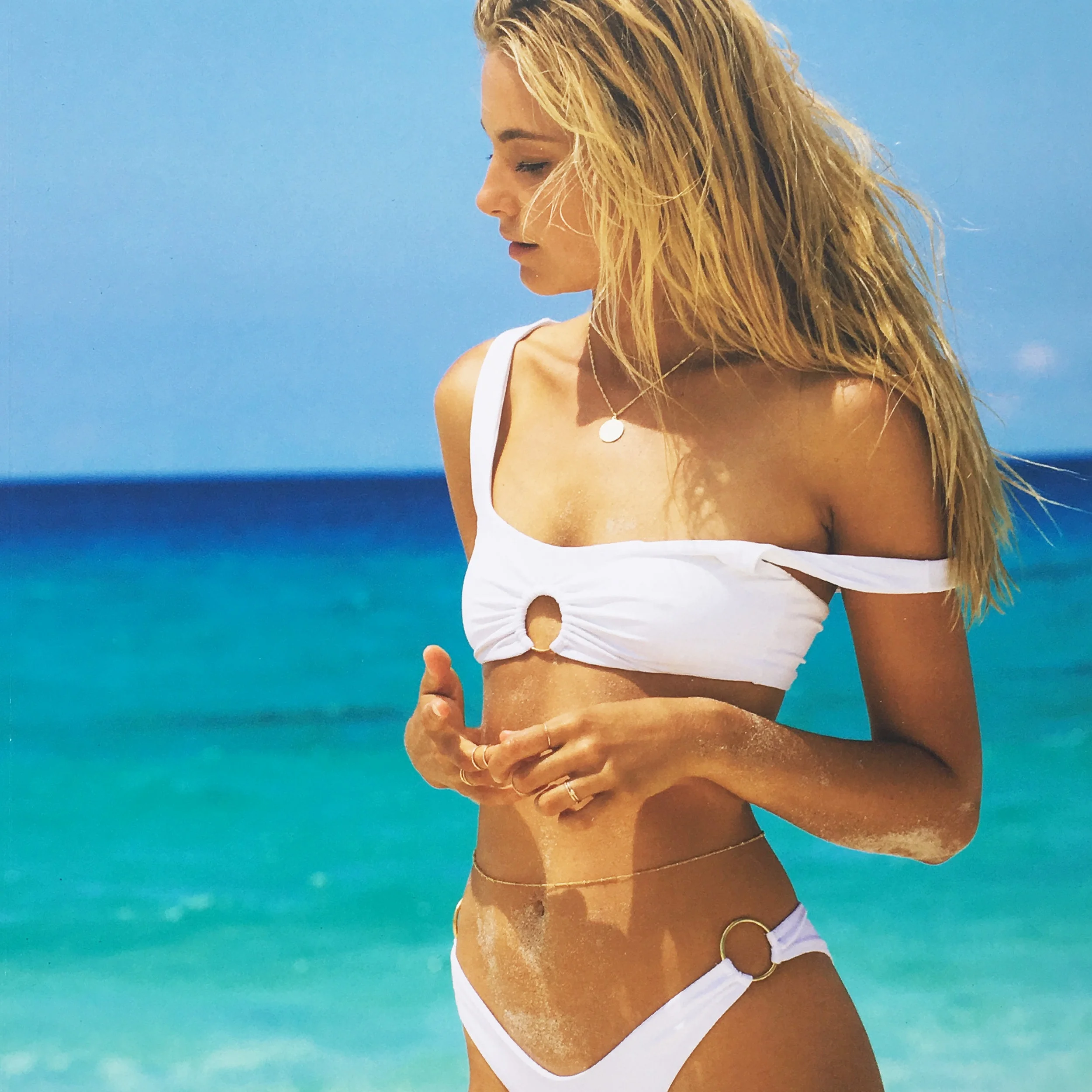
I was tasked with creating a graphic for the word "Paradise" which was to be screen printed on a one piece swimsuit for L*Space swimwear. At the start, the designers wanted to see palm leaves and different forms of hand lettering.
Ultimately, a simple cursive style was selected for the graphic and then I created a simple color block in the background with a Miami Vice color scheme. The goal was an 80's inspired one piece.
This suit is currently being sold on the Free People website and was a featured item. Click here to visit FP.com
An animation created for Things Like Stuff.
Motion graphics created for Shaper Supply Co to showcase the Arctic Foam blanks for ecomm.
Designed in Illustrator and then animated in After Effects for Doggedly Co.
Please click the button below to play the animation.
Email layouts for Joah Brown and L*Space Swimwear. I have also worked on email campaigns for TurboTax and Mint, but due to an NDA I am not permitted to share these designs. Please contact for more information.
Using Photoshop and InDesign, I built this custom email for a weekly email blast and then uploaded it and sent it out through MailChimp. It was part of a test to see if custom built emails preformed better and had a higher rate of being opened than standard templates...it did!
Catalogs and line sheets for L*Space Swim and Joah Brown.
L*Space collaborated with Cocobelle Sandals, this section the goal was to highlight the sandals, and make the instructions for ordering very clear (since it deviates from the rest of the catalog).
I designed the L*Space x Cocobelle logo as well as the size and pre-pack chart.
This was a section created in the back of the catalog as a tool to help buyers when they were ordering from the catalog. It has each apparel piece grouped by all bikini tops, bottoms, one pieces, and apparel.
This was a new section created as a tool to help buyers when shopping the catalog. I arranged each item by delivery into its own spread. That way buyers could easily see their choices in one place instead of constantly flipping through the catalog. We wanted to make their buying experience easier (and it was a hit!)
This was a special section of the catalog that featured one pieces and my watercolor illustrations. The model posed and then once I had the photographs I created custom watercolor illustrations for each shot. The goal was to make a studio photo shoot a little more special and exciting to the people who would later see the catalog.
A line sheet that I created and is used as a selling tool for the company. The line sheets get updated weekly to reflect the current inventory and so the design is constantly changing. This is made in InDesign and in addition to the design and updating the line sheet, I also color correct and retouch photos as needed.
A collection of special projects and collaborations with Free People and Skyy Vodka.
I was tasked with creating a graphic for the word "Paradise" which was to be screen printed on a one piece swimsuit for L*Space swimwear. At the start, the designers wanted to see palm leaves and different forms of hand lettering.
Ultimately, a simple cursive style was selected for the graphic and then I created a simple color block in the background with a Miami Vice color scheme. The goal was an 80's inspired one piece.
This suit is currently being sold on the Free People website and was a featured item. Click here to visit FP.com
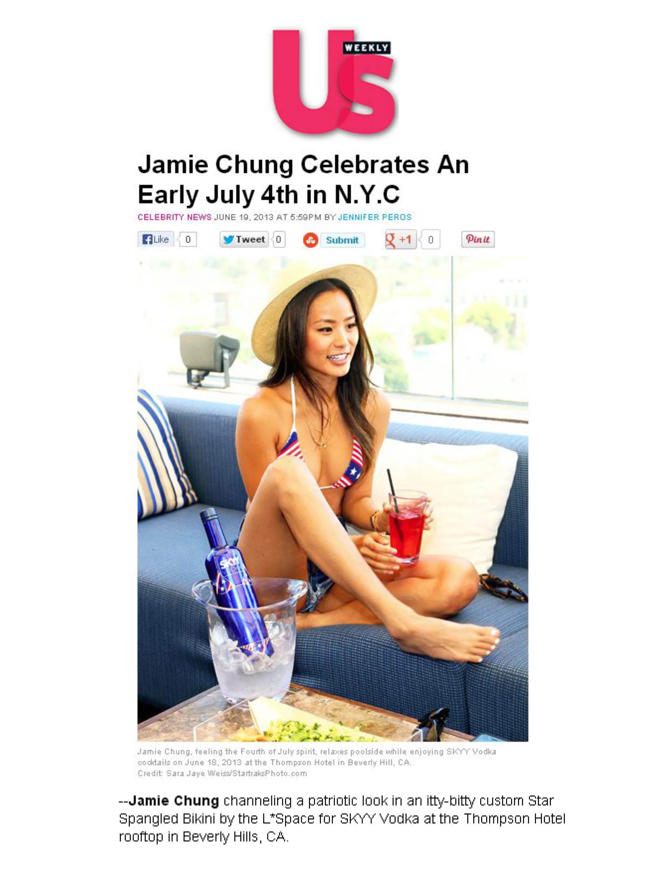
This project was a collaboration between Skyy Vodka and L*Space Swimwear for the 4th of July. The design still had to appeal to men ages 20-40 that lived in the Midwest, as this was their target demographic.
I was responsible for designing and creating the L*Space branded bikini imagery which I did in Adobe Illustrator. As well as the corresponding artwork that was used for the actual swim suit.
Actress Jaime Chung wore the matching bikini that was custom made for the PR event that kicked off the campaign.
I was responsible for retouching swim suit models, apparel models, and floating images of swim suits. I complete all retouching and color correcting in Photoshop.
Each photo/model/item is different and so I use many different techniques and tools within Photoshop. Some clients like heavily retouched looks, while others prefer a much more natural end result. Ultimately, I work towards whatever the client's vision is and accomplish that result.
Web banners designed for Amethyst Nutrition & Wellness, Gamblin Artist’s Colors, Joah Brown, Thousand Mile Outdoorwear, and Sunsets, Inc .
A small collection of print-based work. Including invitations, rack cards, and direct mail pieces.
Designed and illustrated the invitation for the Fathom Curve art show.
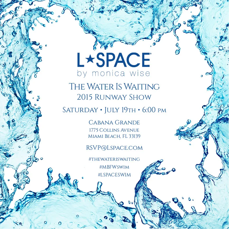
Invitation for the L*Space Runway Show at Mercedes-Benz Fashion Week. Spot UV hits accentuated the water and gave it a wet and shiny look to convey an energetic feel.
A postcard designed for Maio Swim, a division of L*Space.
L*Space Invitation to the 2012 Mercedes-Benz Runway Show. Created a folding passport invitation from concept to completion including vector passport stamps which I made in Illustrator.
Liberty is a well-respected textile house based out of London and this was a page from a pitch for a collaboration with the company. L*Space and Liberty went on to collaborate multiple times on specialty prints exclusively for L*Space. The collaborations sold out several times.
I was responsible for designing a rack card that was placed on in-store displays in art stores all across the country. This card was to announce Gamvar, a new product by Gamblin.
I painted countless swatches which were then attached by hand to each card. The pieces showcased an oil paint swatch that was half-covered with Gamvar Varnish, and half without.
A set of 4 postcards that when laid out side-by-side have connecting elements. This was designed to draw awareness for the plight of the Invisible Children and promote the documentary of the same name.
PIGMENT+PALETTE's box design was a project that included a magnetic closure, matte black satin finish, black gloss UV ink hit, and a custom die cut in the top. The box also had to be shipped flat in order to cut down on shipping costs from the manufacturer.
The outer box was a single piece of cardboard that was printed and scored, then folded around the matte black box for shipping to the customer.
I was the creative director and designer for this project and created everything from the logo, to the packaging, branded tissue paper, and ads. This packaging stood out from all the competitor's subscription boxes because of the specialty printing (UV hit, die cut, and flat black finish) and the magnetic closures that were hidden inside the front lip of the box. The goal was to create a high perceived value with the packaging to offset the contents of the monthly supplies that came inside the box (which ranged from very high quality to mid grade quality).
L*Space private label Shady Lady Sunscreen was a gift with purchase item. I created the design of the label from start to finish. Utilizing our key print from the season, I made that the base of the design and then built on top of that. The neon green was our key solid color for the season, so I combined the two for the final product.
This was created for a health and wellness company to illustrate all the different areas of life that are important to pay attention to and how they are all connected. I designed the infographic incorporating the company's logo (which I also designed) and colors using Illustrator.
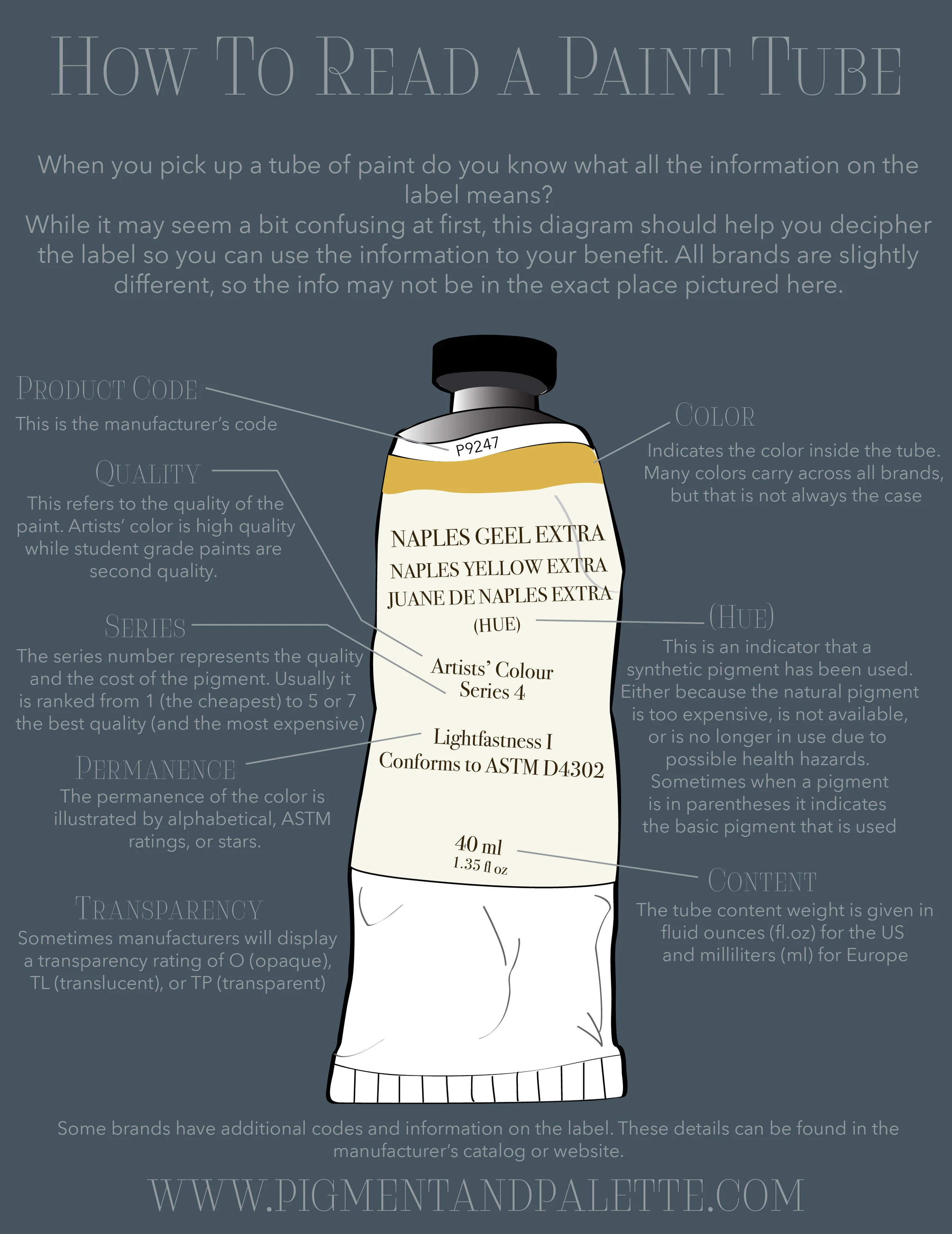
How To Read A Paint Tube is an infographic I created from start to finish. I made the paint tube in Illustrator and then wrote the content and designed the layout in InDesign.
Types of Oil Painting Brushes is another start to finish infographic I created for PIGMENT+PALETTE. I created each brush illustration in Illustrator and then wrote and laid out the copy in InDesign.
Stellar Moto Brand is a line of motorcycle gear for female riders that is as stylish as it is protective. These are mockups for different sew in labels that I created in Adobe Illustrator for the brand.
I was tasked with creating a hang tag that doubled as a sticker. The front showcases the brand logo, has a scored line so the sticker can be peeled off, as well as a hole for it to be attached to the garment. The back lists the company's tagline, website, and social media handles.
This was a hang tag I created that illustrated the 4 different ways a customer could wear the same dress. I illustrated each of the 4 ways using Illustrator and then used InDesign to lay out the design of the hang tag.
L*Space was getting a lot of feedback that customers were confused as to how to correctly wrap this bikini top. I created the illustrations for this in Illustrator and then used InDesign to layout the rest of the hang tag. This went on to become one of the best selling bikini tops in the line.
This hang tag was created for an apparel line that specialized in silk garments. The hang tag is printed on a matte lavender card stock that has a silky feel when touched.
This is the spec sheet that gets sent to the manufacturer that creates the sew in labels for J. Grace. It illustrates the correct size, colors, and other instructions (along with similar examples) so that nothing is left to chance in the manufacturing process.
CADs created using Adobe Illustrator.
L*Space Swimwear Slice of Paradise Campaign created with Adobe Premiere. Footage shot by Ted Emmons.